BRÄNDI VÄRSKENDUS
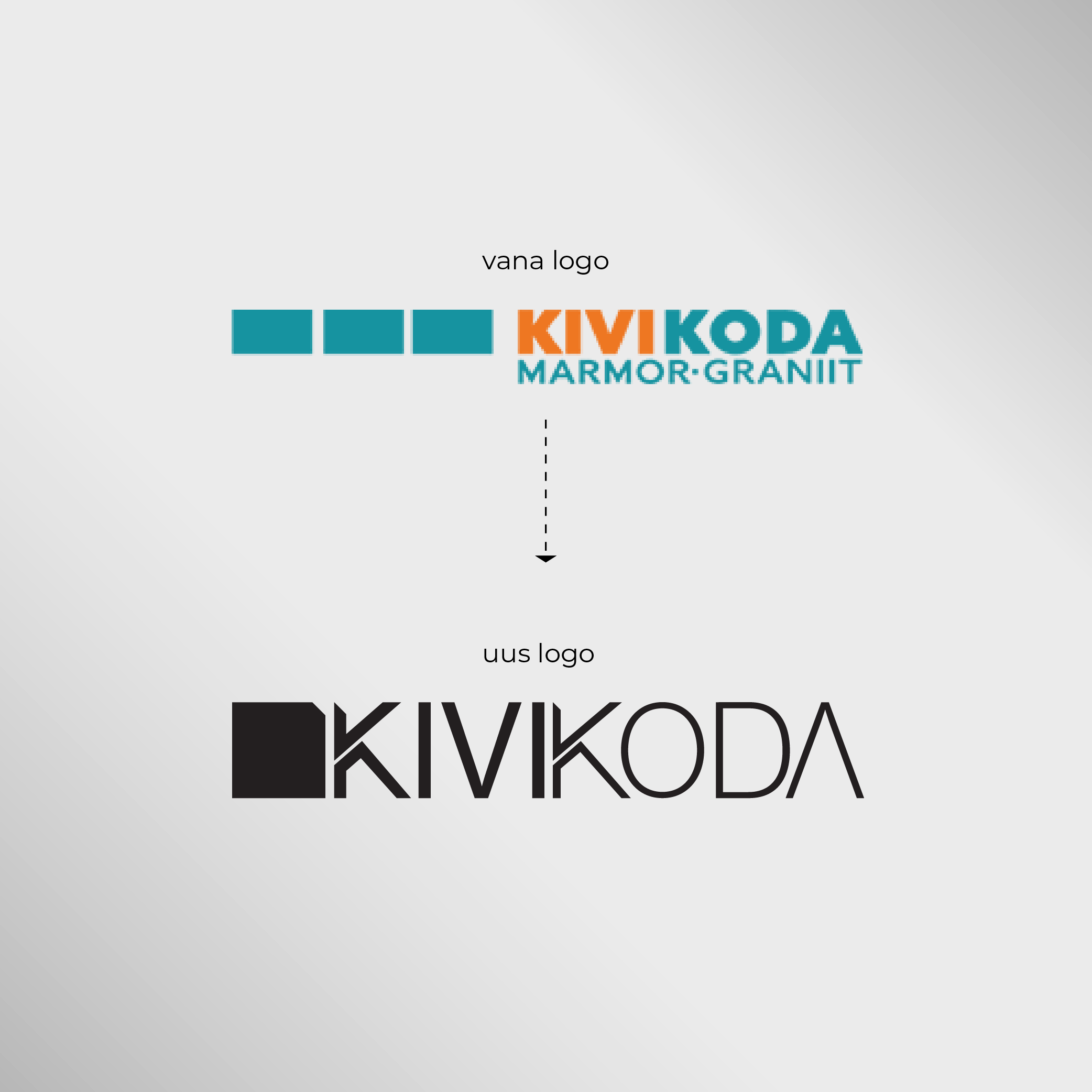
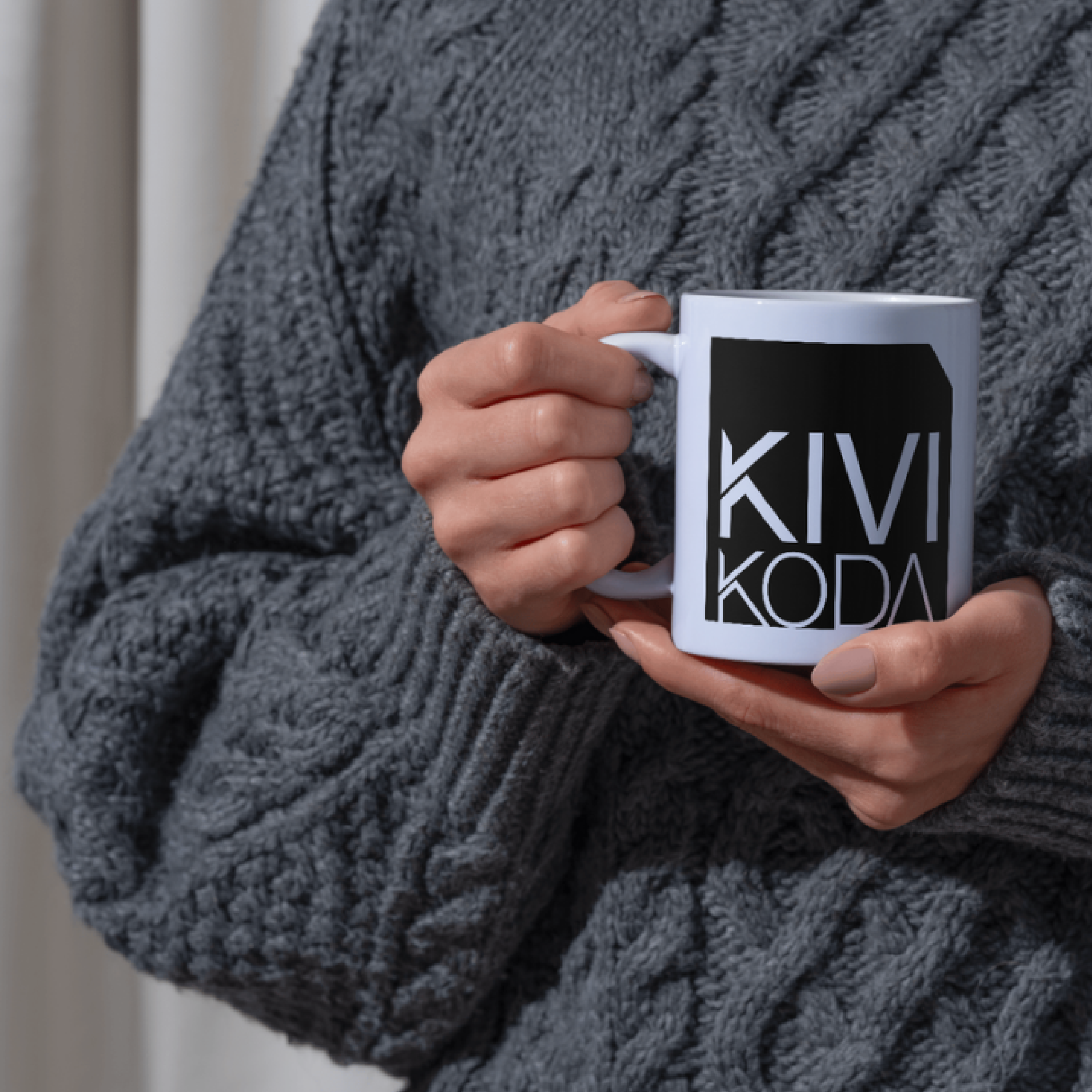
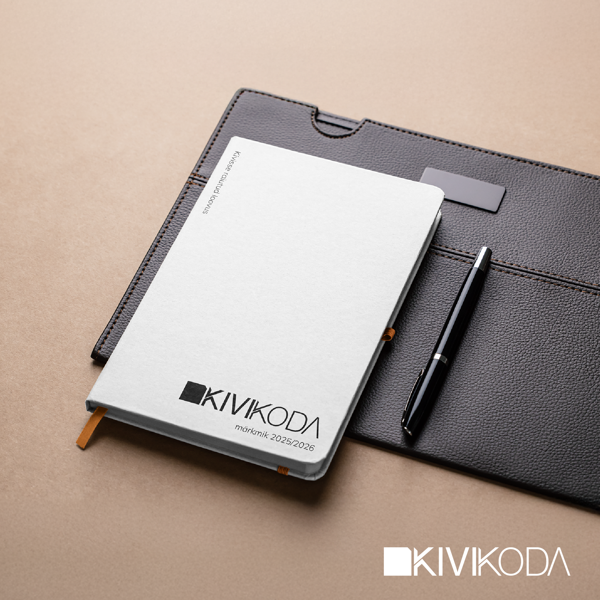
Kivikoda soovis oma brändi värskendada, mistõttu alustasin uuenduskuuriga, mis hõlmas ka uue logo loomist. Koos visuaalse identiteedi uuendamisega tuli leida uus fonditüüp ja sobivad värvitoonid, mis toetaksid ettevõtte isikupära.
INSPIRATSIOON
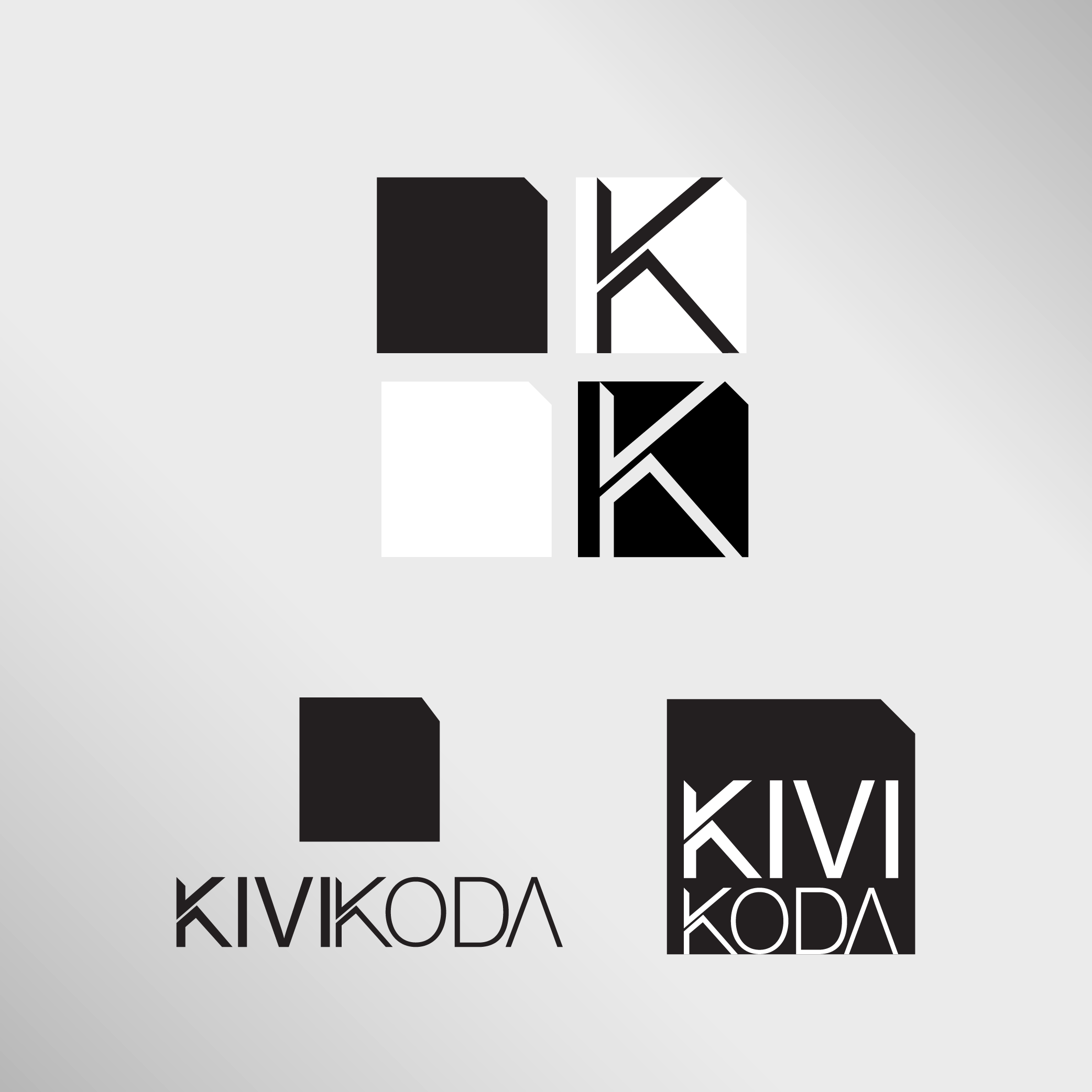
Instead of the old logo with three separate blocks, I designed a single square-shaped symbol with a cut edge, symbolizing the cutting of marble – a direct reference to the company’s core activity. I aimed for a logo that is simple and minimalist, yet full of character. The cutting concept was also incorporated into the design of the letter “K,” emphasizing attention to detail.
TÖÖPROTSESSI KULG...
At the beginning of the process, I created two mood boards for the client, presenting various visual ideas – from typography and color schemes to design elements. For each choice, I included explanations and justifications: why this particular solution was suitable and what meaning it conveyed.
TÖÖPROTSESSI KULG...
The client selected the mood board that resonated most and best matched the company’s essence and style. Based on this, I continued with a competitor analysis and a brief market study to ensure the brand’s relevance and distinctiveness in the market.