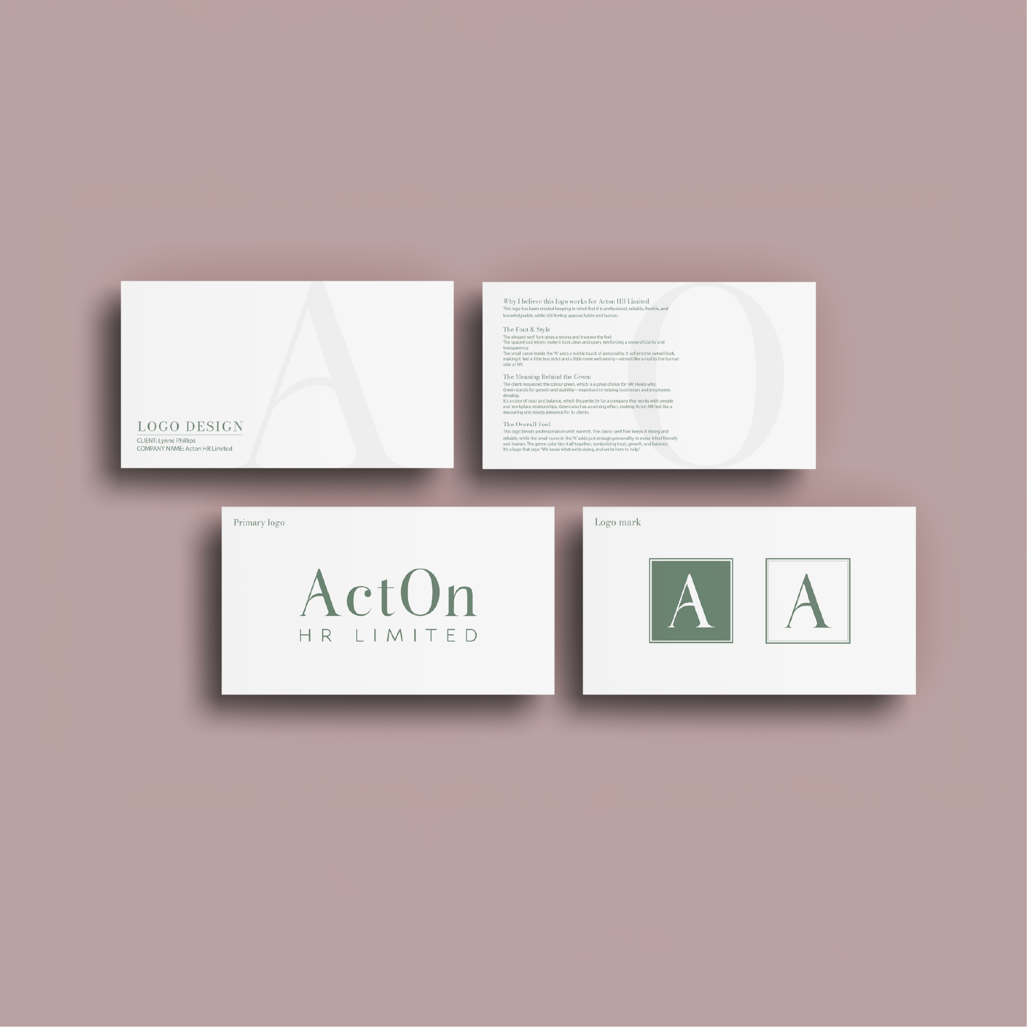
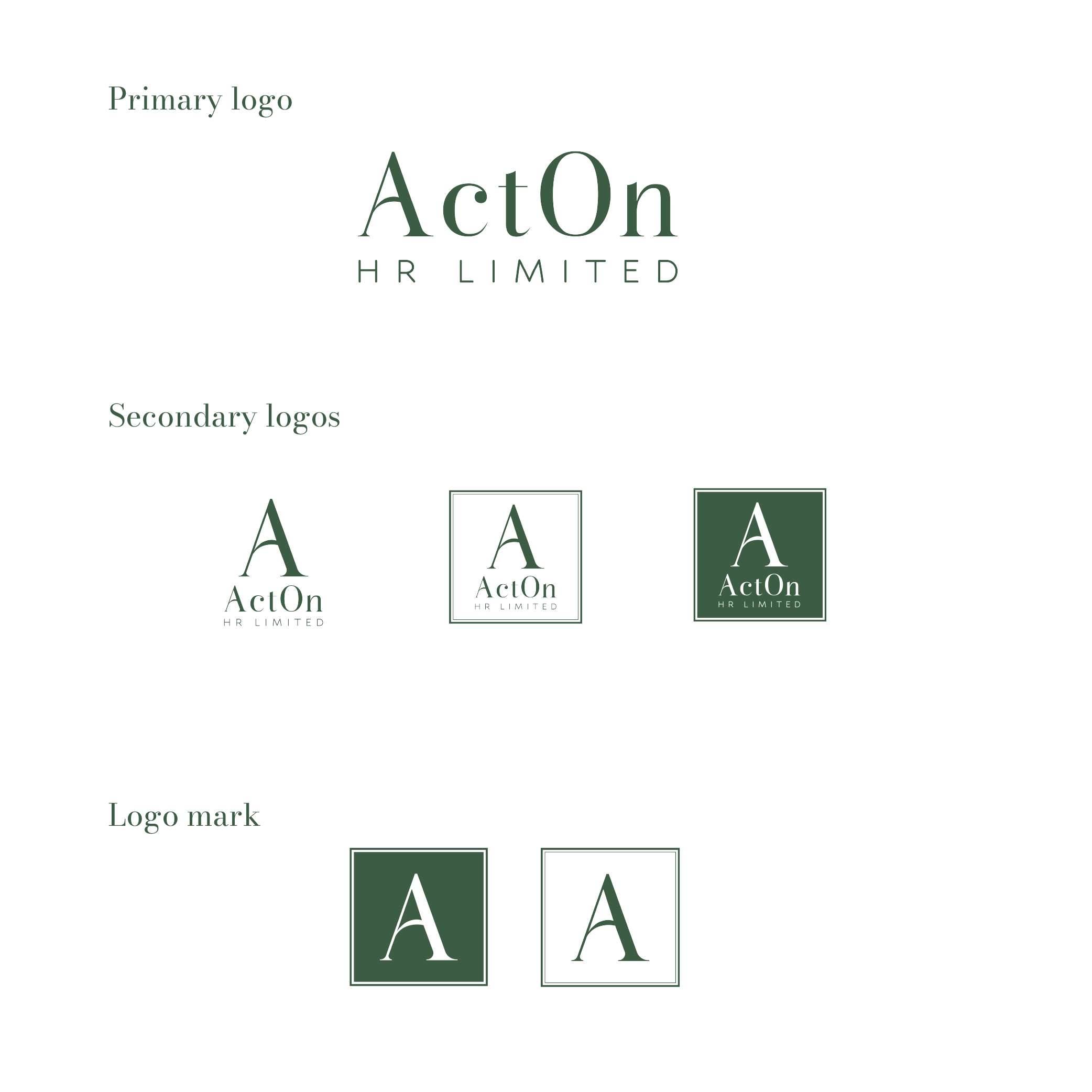
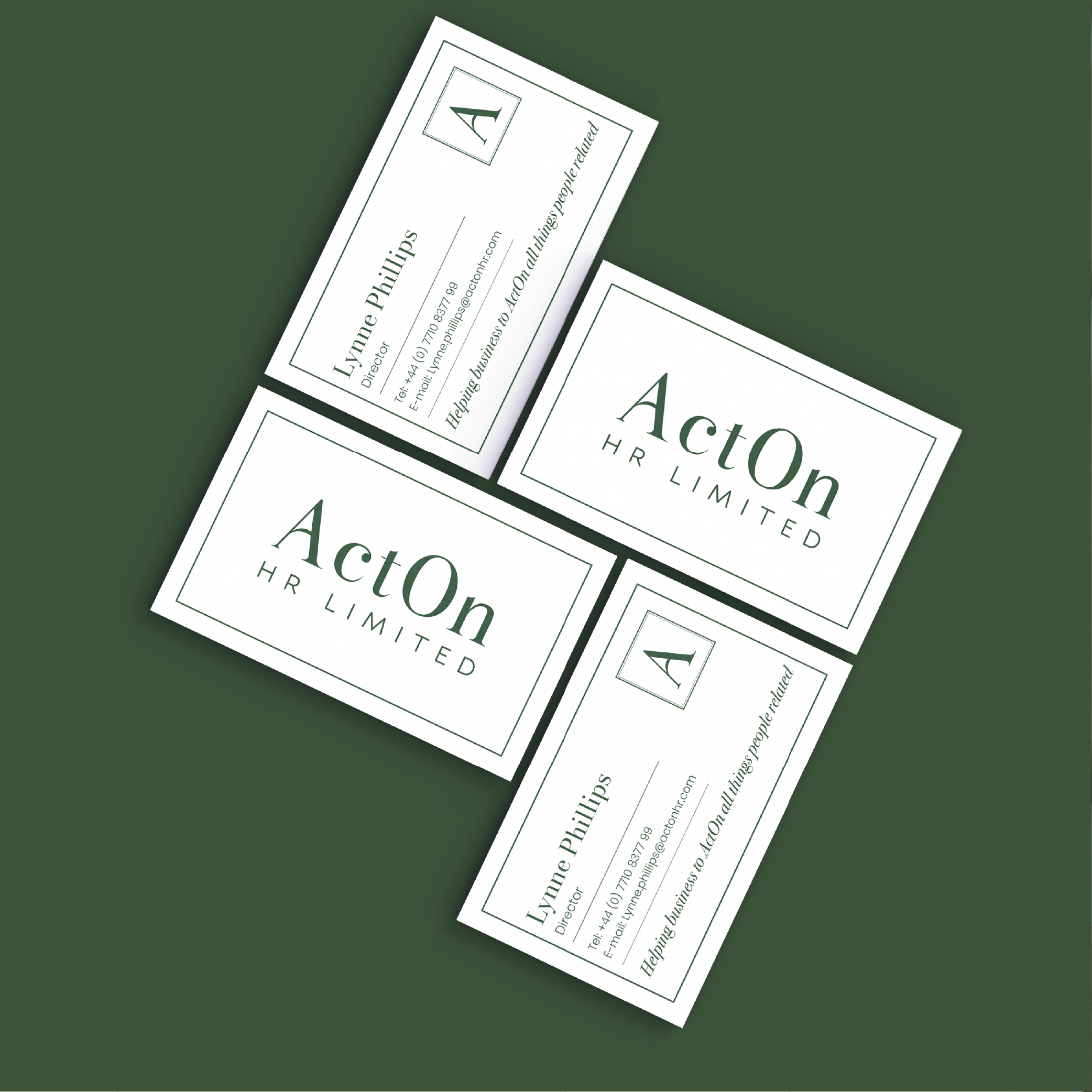
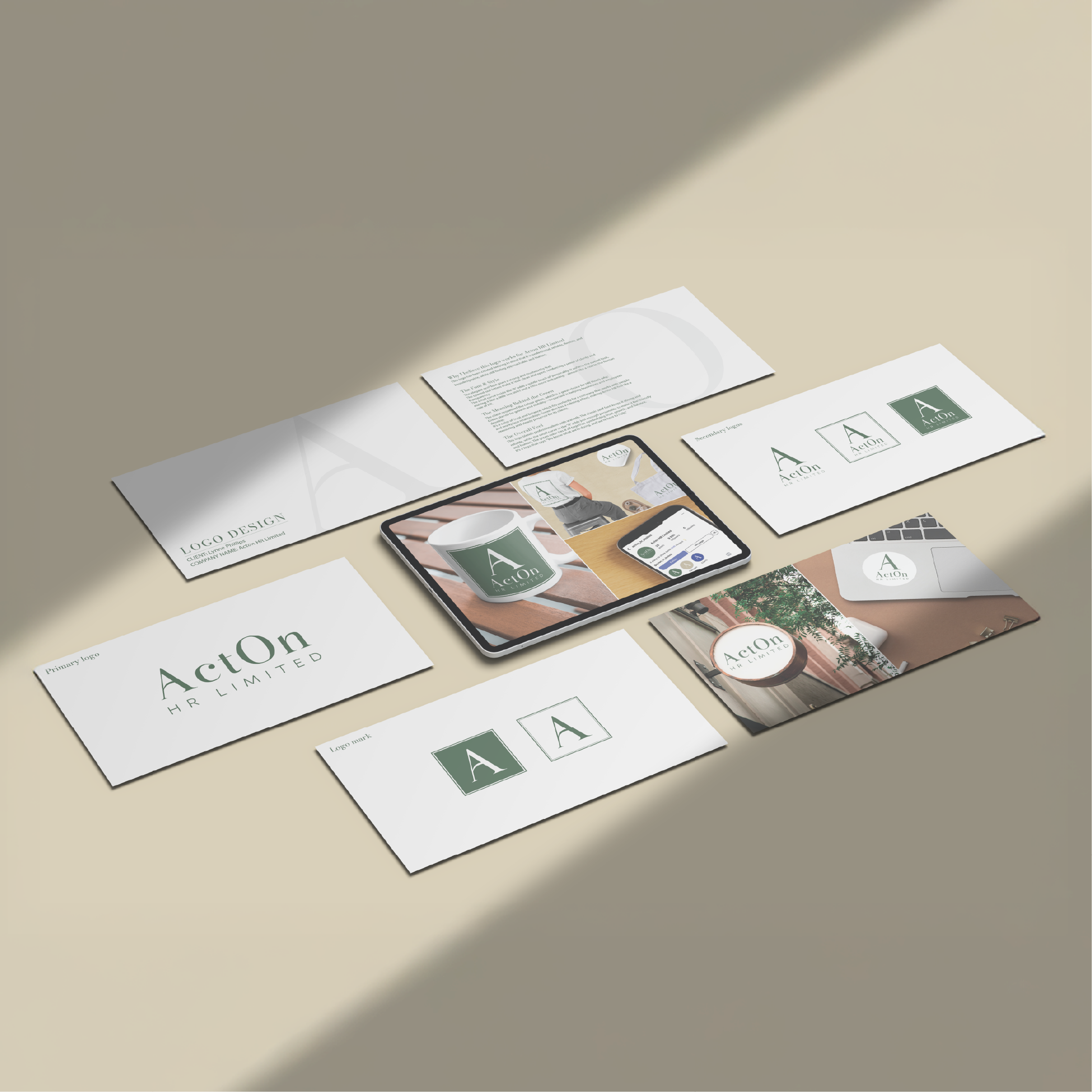
When creating this, I wanted to design a logo for Acton HR Limited that would be professional, while still leaning toward a simple and minimalist direction. I chose an elegant serif typeface, which gives the brand strength and a sense of confidence.
FINAL RESULT
Following the client’s recommendation, I used green as the primary color, which is a great fit for the HR sector. Green symbolizes growth and stability. It is a color associated with trust and balance, helping to create a sense of calm and security that reflects Acton HR’s supportive and dependable role for its clients.